ENGLISH SECTION
How Color Contrast Can Enhance Visual Communication

Color Contrast and Its Significance in Visual Communication
One of the most crucial elements in design is color contrast. The difference between two elements on a page can have a tremendous impact, making each element stand out and attract the appropriate attention. If you want to ensure that an element receives the right focus, it needs to stand out among two or more elements that are entirely different from each other.
Contrast can be found in many aspects, such as the size of the element, color, texture, shape, or typography. One of the most popular ways to create contrast is through color, as it is consistently used to make an element stand out.
Why Is Color Contrast Important?
Color is one of the fundamental elements that you can use to enhance the contrast of a layout. It is constantly used to emphasize a specific element. A small change, such as altering the color of an element, can completely shift the viewer’s attention.
However, the primary advantage of color contrast is that it appears more appealing to the eye. A design where all elements look the same can be dull, so it’s beneficial to make our design more dynamic.
For instance, if you want a design to showcase the benefits of a product, you can use contrast to make viewers see what you want. In this case, you might use a bright, dynamic color for the object you want to draw attention to and a more subtle color for the background.

Optimize Your Content
When all elements on a layout appear the same, it can be challenging for viewers to grasp your message. You can use contrast to make important elements stand out while allowing others to complement the overall result.
Beyond making the design more attractive, color contrast can create a hierarchy in the overall image. This means you can use color to rank the importance of each element in your design. Directing the viewer to specific points makes it easier for them to understand the message you are trying to convey.

Types of Color Contrast
There are seven basic types of color contrast, each serving a slightly different purpose.
- Hue Contrast
- Saturation Contrast
- Temperature Contrast
- Simultaneous Color Contrast
- Extension Contrast
- Complementary Colors
- Dark and light Colors

Conclusion
Introducing color contrast can infuse dynamism into your design. However, it is essential to keep in mind that each element should serve its purpose. When creating color contrast, ensure that you enhance the overall visual appeal and assist the viewer in grasping your message more easily. Strive for a harmonious balance that not only captivates attention but also communicates effectively.
_
Join us on Facebook and be the first to discover our latest news!

Οι καλύτερες ευχές για μια ξεχωριστή καληνύχτα

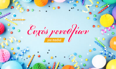
Ευχές γενεθλίων για παιδιά που θα μείνουν αξέχαστες

Μαγικές εικόνες για καλημέρα: Ομορφιά & θετική ενέργεια

20 Γλυκές ευχές & μαγικές εικόνες για καληνύχτα

105 Ονόματα για γάτες που ξεχωρίζουν

5 Μικρόσωμα σκυλιά που αγαπούν το παιχνίδι και τα χάδια

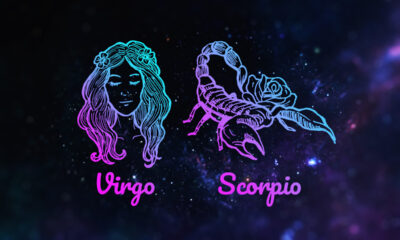
Παρθένος με ωροσκόπο Σκορπιό συμβατότητα & χαρακτηριστικά

10 Greek Philosophers Who Predicted the Future

Τι να μαγειρέψω σήμερα; 10 εύκολες και γρήγορες συνταγές

Σπανακόρυζο διατροφική αξία και η σημασία του για την υγεία

Η νέα εποχή του floral design στη διακόσμηση και το lifestyle

Σχεδιασμός επαγγελματικής κάρτας: όταν η απλότητα γίνεται δύναμη

Πώς η minimal διακόσμηση αλλάζει τον τρόπο που ζούμε τον χώρο

Ιδέες για επαγγελματικές κάρτες με χαρακτήρα και αισθητική ισορροπία

Καλημέρα αλλιώς: εικόνες με αισθητική και θετική ενέργεια

Από αφίσες σε εμπειρίες: Οι κυρίαρχες τάσεις στο wall art

Πίνακες ζωγραφικής: Πώς μεταμορφώνουν τον χώρο και τη διάθεσή μας

Χριστουγεννιάτικα Δώρα που Ξεχωρίζουν χωρίς να Κοστίζουν μια Περιουσία

Χριστουγεννιάτικες εικόνες για έμπνευση πέρα από το προφανές

Όταν η Χριστουγεννιάτικη Διακόσμηση Γίνεται Στάση Ζωής


 LIFESTYLE2 έτη ago
Οι καλύτερες ευχές για μια ξεχωριστή καληνύχτα
- LIFESTYLE3 έτη ago
Ευχές γενεθλίων για παιδιά που θα μείνουν αξέχαστες
- LIFESTYLE2 έτη ago
Μαγικές εικόνες για καλημέρα: Ομορφιά & θετική ενέργεια
- LIFESTYLE2 έτη ago
20 Γλυκές ευχές & μαγικές εικόνες για καληνύχτα
- LIFESTYLE3 έτη ago
105 Ονόματα για γάτες που ξεχωρίζουν
- LIFESTYLE3 έτη ago
5 Μικρόσωμα σκυλιά που αγαπούν το παιχνίδι και τα χάδια
- THE UNKNOWN3 έτη ago
Παρθένος με ωροσκόπο Σκορπιό συμβατότητα & χαρακτηριστικά
- ENGLISH SECTION2 έτη ago
10 Greek Philosophers Who Predicted the Future